Descriptive Statistics and Plots
This file contains descriptive statistics plots and includes the data cleaning process involved with it.
Data Cleaning
If you would like to see some of our data cleaning methods, click “show” to show the code corresponding to each step of the process below:
- Loading and cleaning the data
airplane_df = read_csv("datasets/airplane_crashes_data.csv", show_col_types = FALSE) |>
  janitor::clean_names() |>
  filter(ground != "NULL", aboard != "NULL") |>

  # removes unnecessary columns for our analyses
select(-flight_number, -time, - registration)- Converting 2 digit years to four digit years
airplane_df = airplane_df |>
  mutate(
    # remove leading and trailing spaces
    date = str_trim(date),

    # extract month, day, and year from the date string
    m = as.numeric(sub("/.*", "", date)),
    d = as.numeric(sub(".*/(.*)/.*", "\\1", date)),
    y = as.numeric(sub(".*/(.*)$", "\\1", date)),

    # convert 2-digit years (<100) to 4-digit (1900s)
    y = ifelse(y < 100, y + 1900, y),

    # rebuild the string
    date_clean = paste(m, d, y, sep = "/"),

    # convert to Date type
    date = mdy(date_clean),

    # extract numeric year and month
    year = year(date),
    month = month(date),
    month_name = factor(month(date,
                              label = TRUE,
                              abbr = TRUE),
                              levels = month.abb)
  ) |>
select(-m, -d, -y, -date_clean) # remove unnecessary columns- Converting variables to their proper variable types
airplane_df = airplane_df |>
  mutate(
    aboard     = as.numeric(aboard),
    fatalities =  as.numeric(fatalities),
    ground     = as.numeric(ground),
    operator   = as.factor(operator)  # to group by operator
)- Creating a decade column, now that year is numeric
airplane_df = airplane_df |>
  mutate(
    decade = floor(year / 10) * 10,
    decade = paste0(decade, "s")
  ) |>
  select(date, year, decade, month, month_name, everything())
Descriptive Statistics
airplane_df |>
  summarise(
    across(where(is.numeric), list(
      mean = ~mean(.x, na.rm = TRUE),
      sd = ~sd(.x, na.rm = TRUE),
      min = ~min(.x, na.rm = TRUE),
      max = ~max(.x, na.rm = TRUE),
      missing = ~sum(is.na(.x))
    ), .names = "{col}_{fn}")
  ) |>
  pivot_longer(everything(), names_to = c("variable","stat"), names_sep = "_") |>
  pivot_wider(names_from = stat, values_from = value) |>
  gt() |>
  tab_header(
    title = "Airplane Dataset Summary"
)| Airplane Dataset Summary | |||||
| variable | mean | sd | min | max | missing |
|---|---|---|---|---|---|
| year | 1971.408327 | 22.336769 | 1908 | 2009 | 0 |
| month | 6.641520 | 3.544293 | 1 | 12 | 0 |
| aboard | 27.589190 | 43.109636 | 0 | 644 | 0 |
| fatalities | 20.104851 | 33.238341 | 0 | 583 | 0 |
| ground | 1.611154 | 54.039316 | 0 | 2750 | 0 |
Our dataset, airplane_df, has 5,236 rows and 14
variables (columns). Some variables had missing values, such as
location, route, type,
cn_in, summary, and operator, but
our key numeric variables had no missing values. This summary table
outlines the mean, sd, and minimum and maximum value of the key numeric
variables in our dataset.
The cleaned dataset included the following variables:
date: A date variable representing the date of the crash.year: The year of the crash, stored as a numeric value.decade: The decade of the crash, stored as a character.month: The month of the crash, stored as a numeric value.month_name: The name of the month of the crash, stored as an ordered factor.location: The location of the crash, stored as a character.operator: The plane operator type, stored as a factor.route: The route the plane was taking, stored as a character.type: The aircraft type, stored as a character.cn_in: A unique identifier of the construction/serial number of the plane.aboard: The number of people aboard the plane, stored as a numeric value.fatalities: The number of people who died on the plane, stored as a numeric value.ground: The number of people who died on the ground related to the crash, stored as a numeric value.summary: A description explaining the cause of the plane crash, stored as a character.
Final Plots
Interactive Map of Airplane Crashes per Year
airplane_df |>
  count(year) |>
  plot_ly(
    x = ~year,
    y = ~n,
    type = "scatter",
    mode = "lines+markers",
    hovertemplate = "Year: %{x}<br>Crashes: %{y}<extra></extra>"
  ) |>
  layout(
    title = list(
      text = "Airplane Crashes per Year",
      y    = 0.98,
      font = list(size = 20)
    ),
      xaxis  = list(
      title  = list(
        text = "Year",
        font = list(size = 16)
      )
      ),
      yaxis  = list(
      title  = list(
        text = "Number of Crashes",
        font = list(size = 16)
      )
    )
  )
In the early years of flight, there were not as many airplanes in the sky, so the relatively low number of crashes from the early 1900s to 1940 make sense. Beginning in the late 1940s to early 50’s, more people started flying, which coincides with an increase in crashes. The commercial jet service was introduced in 1952, which is where we see a steady increase in crashes after that.
Number of People Aboard per Crash per Year
plot_ly(
  data = airplane_df,
  x = ~year,
  y = ~aboard,
  type = 'scatter',
  mode = 'markers',
  marker = list(color = 'orange', size = 6),
  text = ~paste("Crash Year:", year, "<br>People Aboard:", aboard),
  hoverinfo = 'text'
) |>
  layout(
    title = "Number of People Aboard per Crash Over Time",
    xaxis = list(title = "Year"),
    yaxis = list(title = "People Aboard")
  )
It is useful to see the general trends in the number of people on planes that crashed per year. Overall, there is a steady upward trend in the number of people on the crashed planes as aircrafts could hold more people.
Average Fatality Rate per Year
I have excluded the year 2001, which was an outlier and had 5,641 fatalities, because of the 9/11 attacks.
# calculate the avg fatality rate per year
fatality_trends = airplane_df |>
  filter (aboard > 0) |>
  filter(year != 2001) |>
  mutate(fatality_rate = fatalities/aboard) |>
  group_by(year) |>
  summarize(avg_fatality_rate = mean(fatality_rate, na.rm = TRUE),
            n_crashes = n())

# plot the trends interactively
plot_ly(
  data = fatality_trends,
  x = ~year,
  y = ~avg_fatality_rate,
  type = 'scatter',
  mode = 'lines+markers',
  line = list(color = 'blue', width = 2),
  marker = list(color = 'blue', size = 6),
  text = ~paste("Year:", year,
                "<br>Avg Fatality Rate:", round(avg_fatality_rate, 3),
                "<br>Number of Crashes:", n_crashes),
  hoverinfo = 'text'
) |>
  layout(
    title = "Average Fatality Rate per Airplane Crash Over Years",
    xaxis = list(title = "Year"),
    yaxis = list(title = "Average Fatality Rate")
  )
The average airplane fatality rate per year was as high as 100% in the 1910s and 1920s and shows a downward trend as the years progress, showing that, when there is a crash, there are less fatalities on the airplane. Although, the percentage is still well above 50%.
Top 15 Airline Operators with the Most Crashes
airplane_df |>
  group_by(operator) |>
  summarise(total_crashes = n(), .groups = "drop") |>
  slice_max(total_crashes, n = 15) |>  # select the top 15 operators
  ggplot(aes(x = reorder(operator, total_crashes), y = total_crashes )) +
  geom_col(fill = "blue") +
  coord_flip() +
  labs(
    title = "Airline Operators with Most Crashes",
    x     = "Airline Operators",
    y     = "Number of Crashes"
) 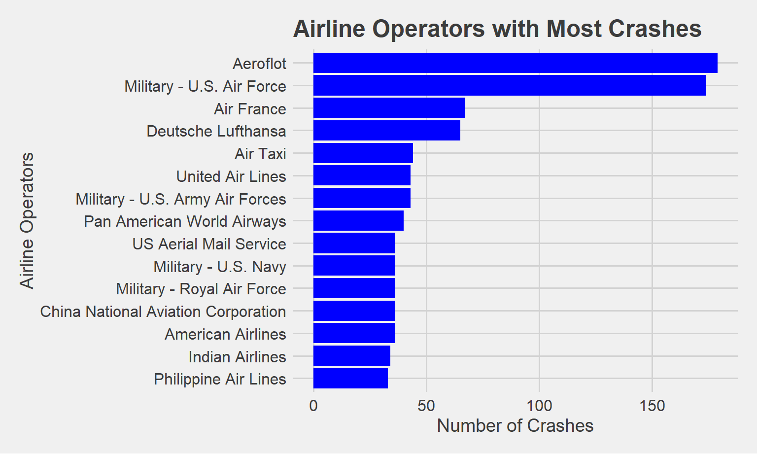
Aeroflot, the largest airline in Russia, is by far the commercial airline with the greatest crashes at 187 total crashes. The U.S. Air Force, a military airline, comes in close second at 182 total crashes.
Aircrafts with the Most Crashes
airplane_df |>
  filter(!is.na(type)) |>
  group_by(type) |>
  summarize(total_crashes = n(), .groups = "drop") |>
  slice_max(total_crashes, n = 15) |>
  ggplot(aes(x = reorder(type, total_crashes), y = total_crashes)) +
  geom_col(fill = "darkgreen") +
  coord_flip() +
  labs(
    title = "Aircrafts with the Most Crashes",
    x     = "Number of Crashes",
    y     = "Aircraft Type"
  )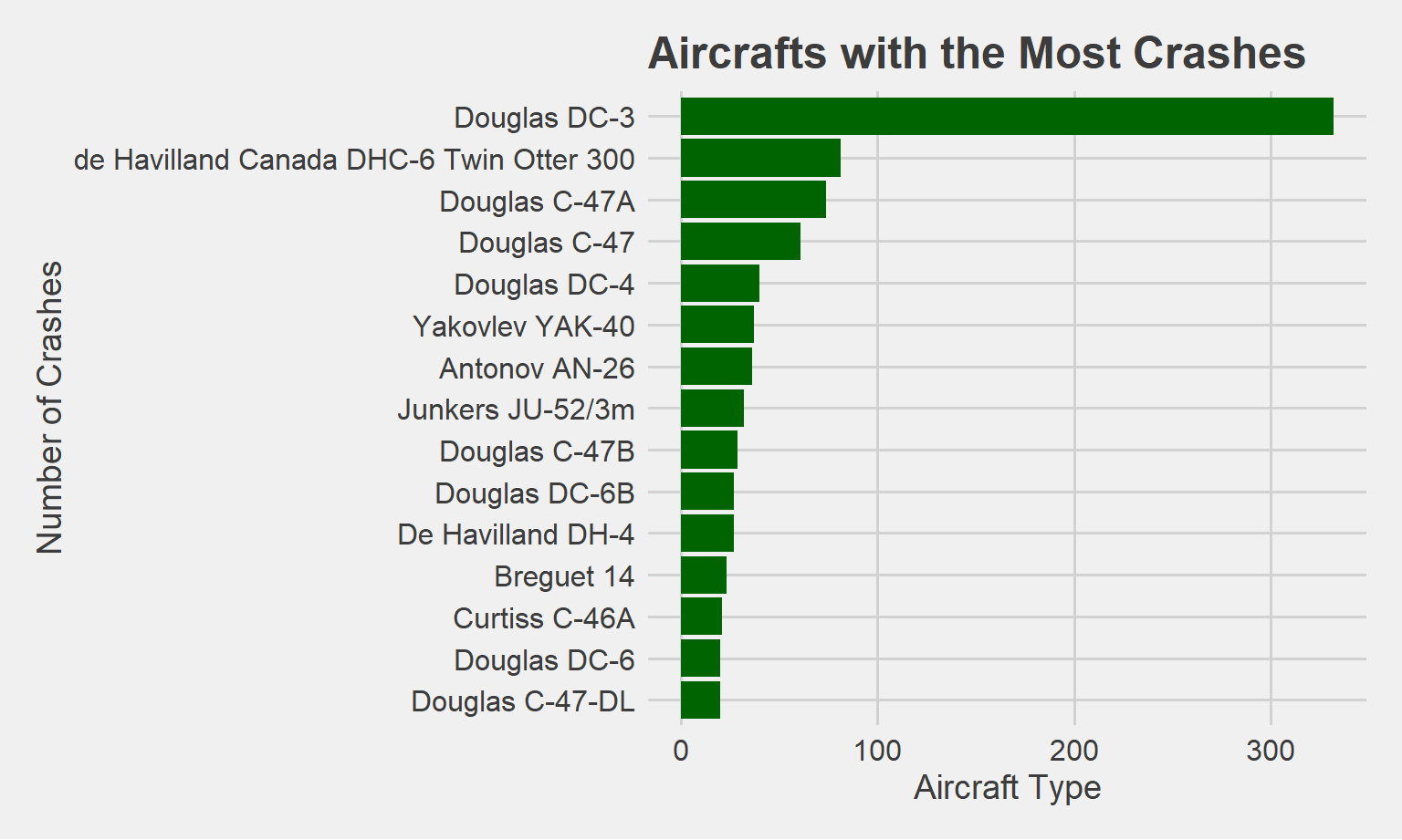
The Douglas DC-3 has had by far the most crashes out of all the aircraft types. Most of the planes in this graph are Douglas aircrafts. Interestingly, the Douglas DC-3 became the most successful airliner in the formative years of air transformation, and was the first to fly profitably without government subsidy.
Seasonal and Yearly Trends displayed on a Heat Map
# heatmap of crashes by year and month
airplane_df |>
  count(decade, month_name) |>  # counts crashes in the decade/month
  ggplot(aes(x = decade, y = month_name, fill = n)) +
  geom_tile(color = "white") +
  scale_fill_gradient(low = "white", high = "red") +
  labs(title = "Heatmap of Airplane Crashes by Year and Month",
       x = "Decade",
       y = "Month",
       fill = "Number of Crashes")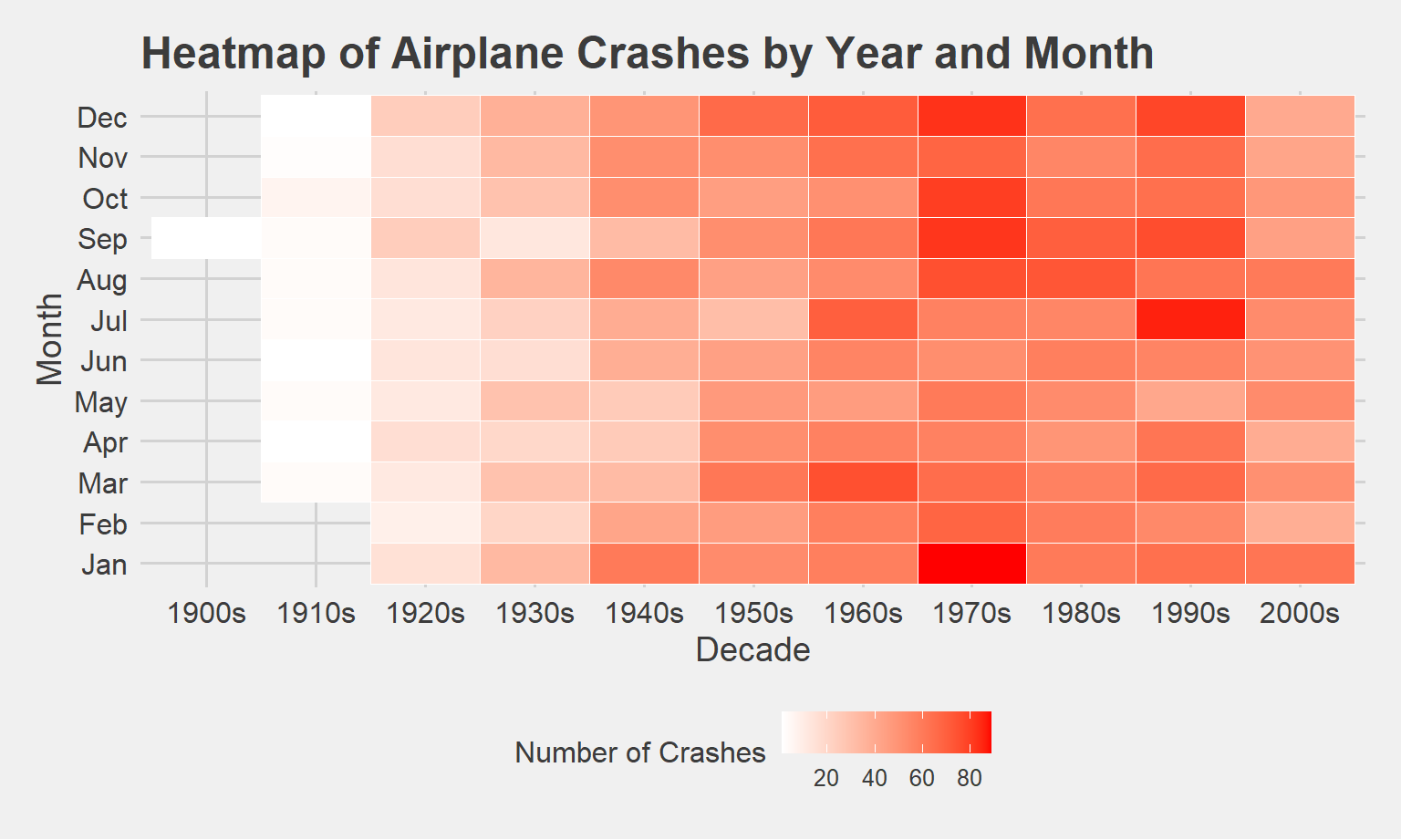
Based on this map, the 1970s, particularly the January, December, October, September, and August months have especially high numbers of crashes compared to other decades and months. July in the 1990s, also had a particularly high number of crashes, indicated by the darker red color. The monthly and seasonal trends will be looked at in more detail using ANOVA.